Custom Visualization with ggplot2 and plotly
Source:vignettes/custom-visualization.Rmd
custom-visualization.Rmdplot_orbits() and plot_orbits_3d() are
convenience functions for quick trajectory plots — they’re designed to
get you a useful visualization in one line so you can focus on setting
up the physics. But the real power of orbitr is that
simulate_system() returns a standard tidy tibble. You can
use ggplot2, plotly, or any other
visualization tool directly on the output.
The Raw Output
Here’s what the simulation tibble looks like:
sim <- create_system() |>
  add_body("Earth", mass = mass_earth) |>
  add_body("Moon",  mass = mass_moon, x = distance_earth_moon, vy = speed_moon) |>
  simulate_system(time_step = 3600, duration = 86400 * 28)

sim
#> # A tibble: 1,346 × 9
#>    id       mass          x           y     z      vx          vy    vz  time
#>    <chr>   <dbl>      <dbl>       <dbl> <dbl>   <dbl>       <dbl> <dbl> <dbl>
#>  1 Earth 5.97e24         0         0        0   0        0            0     0
#>  2 Moon  7.34e22 384400000         0        0   0     1022            0     0
#>  3 Earth 5.97e24       215.        0        0   0.119    0.000571     0  3600
#>  4 Moon  7.34e22 384382520.  3679200        0  -9.71  1022.           0  3600
#>  5 Earth 5.97e24       860.        4.11     0   0.239    0.00229      0  7200
#>  6 Moon  7.34e22 384330083.  7358065.       0 -19.4   1022.           0  7200
#>  7 Earth 5.97e24      1934.       16.5      0   0.358    0.00514      0 10800
#>  8 Moon  7.34e22 384242692. 11036262.       0 -29.1   1022.           0 10800
#>  9 Earth 5.97e24      3438.       41.1      0   0.477    0.00914      0 14400
#> 10 Moon  7.34e22 384120357. 14713454.       0 -38.8   1021.           0 14400
#> # ℹ 1,336 more rows
Each row is one body at one point in time. Every column is available
for plotting, filtering, or analysis. Since this is just a tibble, you
have the full power of dplyr and ggplot2 at
your disposal.
Custom ggplot2 Visualizations
For example, in the Earth-Moon system, plot_orbits()
shows overlapping circles because both bodies orbit their shared
barycenter at roughly the same scale. A more useful visualization might
plot each body’s distance from the barycenter over time:
library(ggplot2)

sim |>
  dplyr::mutate(r = sqrt(x^2 + y^2)) |>
  ggplot(aes(x = time / 86400, y = r, color = id)) +
  geom_line(linewidth = 1) +
  labs(
    title = "Distance from Barycenter Over Time",
    x = "Time (days)",
    y = "Distance (m)",
    color = "Body"
  ) +
  theme_minimal()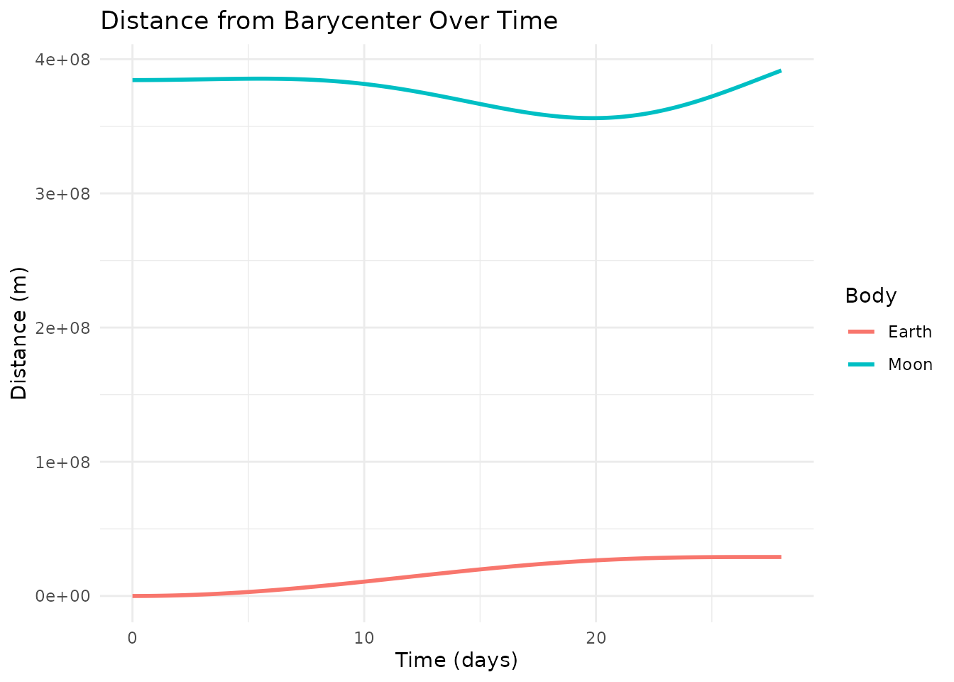
Or plot the Moon’s path relative to Earth with a color gradient showing the passage of time:
sim |>
  shift_reference_frame("Earth", keep_center = FALSE) |>
  ggplot(aes(x = x, y = y, color = time / 86400)) +
  geom_path(linewidth = 1.2) +
  scale_color_viridis_c(name = "Day") +
  coord_equal() +
  labs(title = "Lunar Orbit (Earth-Centered)", x = "X (m)", y = "Y (m)") +
  theme_minimal()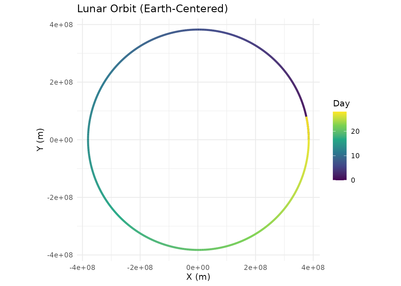
Custom plotly Visualizations
Just as plot_orbits() is a quick convenience for 2D
work, plot_orbits_3d() is a quick convenience for 3D. Both
are intentionally simple — they get you a useful plot in one line so you
can focus on the physics, not the formatting. When you need more
control, the simulation tibble works just as well with
plotly as it does with ggplot2.
For example, you could color trajectories by speed rather than by body:
library(plotly)
#>
#> Attaching package: 'plotly'
#> The following object is masked from 'package:ggplot2':
#>
#>     last_plot
#> The following object is masked from 'package:stats':
#>
#>     filter
#> The following object is masked from 'package:graphics':
#>
#>     layout

sim <- create_system() |>
  add_body("Earth", mass = mass_earth) |>
  add_body("Moon",  mass = mass_moon,
           x = distance_earth_moon,
           vy = speed_moon * cos(5 * pi / 180),
           vz = speed_moon * sin(5 * pi / 180)) |>
  simulate_system(time_step = 3600, duration = 86400 * 28)

sim <- sim |>
  dplyr::mutate(speed = sqrt(vx^2 + vy^2 + vz^2))

plot_ly() |>
  add_trace(
    data = dplyr::filter(sim, id == "Moon"),
    x = ~x, y = ~y, z = ~z,
    type = 'scatter3d', mode = 'lines',
    line = list(
      width = 5,
      color = ~speed,
      colorscale = 'Viridis',
      showscale = TRUE,
      colorbar = list(title = "Speed (m/s)")
    ),
    name = "Moon"
  ) |>
  add_trace(
    data = dplyr::filter(sim, id == "Earth"),
    x = ~x, y = ~y, z = ~z,
    type = 'scatter3d', mode = 'lines',
    line = list(width = 3, color = 'gray'),
    name = "Earth"
  ) |>
  layout(
    title = "Lunar Orbit Around Earth",
    showlegend = FALSE,
    scene = list(
      xaxis = list(title = 'X (m)'),
      yaxis = list(title = 'Y (m)'),
      zaxis = list(title = 'Z (m)'),
      aspectmode = "data"
    )
  )
The point is the same as with ggplot2:
simulate_system() returns a standard tibble, so you have
full access to plotly’s API for anything the built-in
plotting functions don’t cover.